WEEK 1
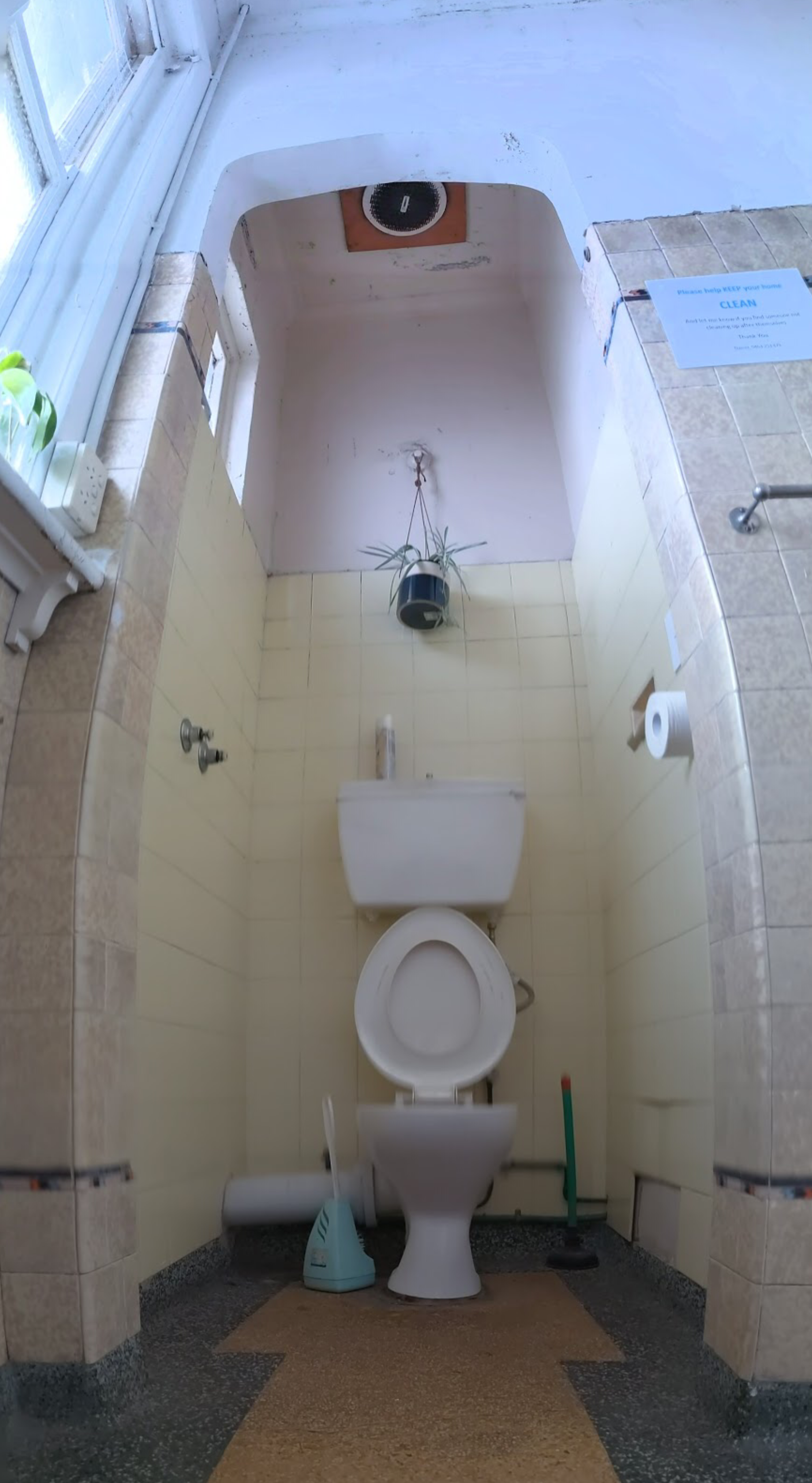
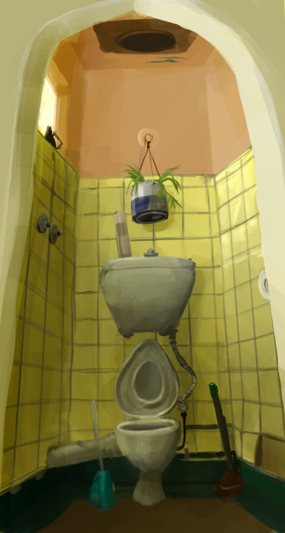
In response to this weeks theme of Observation, I made a digital painting of a toilet in my apartment block, using procreate.
What stuck out to me about this week's lecture was comparisons from real life objects to "scientifically" represented objects. I think I zeroed in on this specific theme because direct perfect ‘realism’ in representation is something that has been important to me for a long time, and the unintentional difference between representation and reality says a lot about the world, artists and art.
So my process was to:
-find something in my apartment block I’ve never seen before, something with lots of detail.
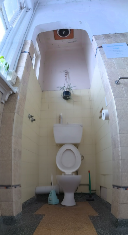
-photograph it for later comparison
-take notes on it
-do pen sketches of it
-go somewhere totally separate from it and try to recreate it from my paratexts (excluding the photos)
-compare this to the photos and examine the differences
The major differences between the elements include:
-COLOUR:
Immediately I noticed that photos did not capture the acid yellow colour of the room, not sure why, but I knew this problem, along with the problem of my pen sketches being uncoloured, would mean I would have to memorise colours used. My final colours are representative of how I remember the room looking, though having gone back and seen the room, I did actually overshoot just how yellow/green it was. This is, however, exactly as yellow/green as it *felt*.
-DETAILS:
Several key details of the room are missing, most importantly the old soap dish that indicates that this toilet used to be a shower. My aim was to capture the spirit/character of the room and missing out this fun piece of narrative actually harms that aim. I was too focused on other details I guess. Also several things are about the right shape, but the wrong colour. And there’s considerably less “grime” and wall scratches.
-EXAGGERATION:
I did push for exaggeration in my work because it would help me convey the characterful shapes that I took away from the original image (the egg shaped toilet seat, the warp in the floor that made the plunger and cleaner both lean the same way, the missing tiles.) But a lot of exaggeration was unintentional: the top of the pointed doorway lacks the subtlety or artistic intent of the original and comes across like a cartoon lancet arch instead of a slight Tudor arch. Another interesting result of the comparison was realising how many things I actually underplayed. The plant, for example has a wild, fun shape in the photograph but a small weary shape in the painting. I think in my effort to speed paint, I was just referencing my own ideas of what a spider plant looks like and making it simpler and smaller for the sake of ease and what I thought was realism.
By comparing these two things, I’ve showed what elements of recreation and representation I’m willing to sacrifice over others. I took notes on detail and wanted to represent character, but I missed details that added character. I liked the colour I ended up with because it was an emotive representation of how the colours first impacted me. Overall I learned to take even more comprehensive notes, to better appreciate the elements more subtle elements that I like and want to include as they are, or perhaps exaggerate differently.
About This Work
By Holland Kerr
Email Holland Kerr
Published On: 06/03/2021